
Yes, they're ugly, but what happens when you want to pull your shirt over your head in exuberant celebration of a goal. Unfortunately, the King has you covered....literally.

This is a step way too far, and if I played for Getafe, I could never, ever use my shirt in that fashion. Absolutely horrible. But anyways, I thought I'd do a segment on the (many) ugly kits that will be breaking your televisions in the coming year. The aforementioned Getafe wins due to their shameless marketing, but lets see who else makes the cut. Starting with England:
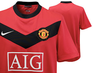
Manchester United Home Kit
This isn't sour grapes, it's really just, I mean look at them. They look a Chevron ad.

Newcastle United Away Kit
Uh, this looks like a fancy French vanilla ice cream, that really doesn't turn out too well. Pretty god-awful.
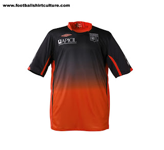
Olympique Lyonnais Away Kit
Good god.

Everton FC Home Kit
Sorry Kyle, this is a pretty ugly shirt. Big downgrade.
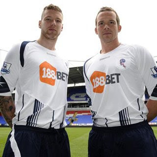
Bolton Wanderers Home Kit
I keep picking on the Brits, but they're losing the money battle, the champions league and NOW, the fashion battle. I don't even know what to say about Bolton's new jerseys, total dogshit.
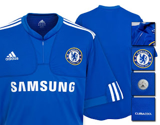
Chelsea FC Home kit
This really comes down to something simple. You're Chelsea. You have a great shade of blue for your home color. Your jerseys should always just look fantastic. And then, you listen to Kramer and decide you need a "manssiere"
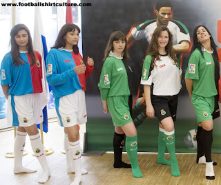
Racing Santandar All Kits
The chicks are great, but these colors are not. This is a crayon box on crack.

Beskitas Away Kit
Some people claim they like this. Then again, some people claim to enjoy watching cricket.
Well I'm done, there are some gloriously ugly kits for you guys to get excited about. This was in no way exhaustive (I looked for maybe 15 minutes), so if you guys find some other fantastically fugly shirts, post them up!

3 comments:
Apologies on the formatting, I did it at work, and I guess on each computer it formats it differently....rather unfortunate.
I have a couple things to say, first off great post Giblinho. Secondly, I think that the Getafe kit is HILARIOUS, I am considering getting one just for the King on the underside (how can you say you wouldn't pull it over your head if you scored?! I for one would abuse that to no end!) And finally, I wanted to point out another ugly kit, that of Tottenham Hotspur (the home strip).
http://www.footy-boots.com/wp-content/uploads/2009/06/spurs-home.jpg
I don't know how to insert pictures into stuff like this, but just look at that thing. The yellow up on the collar makes it look like it's got a cape, and then the yellow down the sides looks like an out of control pit stain! Really just not a great jersey. I do like our 3rd kit this year, however due to the current financial crisis I will not be purchasing one unless we sign an American, in which case I would feel obligated.
Yeah those Tottenham jerseys are pretty bad. I personally think Bolton's are the worst. Not a good year for English jerseys.
Post a Comment